Widgets for controlling the functions of IoT devices in the 2Smart Cloud mobile app
Platform vendors have access to an extensive library of widgets that can be utilized to customize the mobile app's interface. In many cases, you can manage the same device function with several widgets. We recommend that you compare similar-functioning options and select the most suitable one for your product.
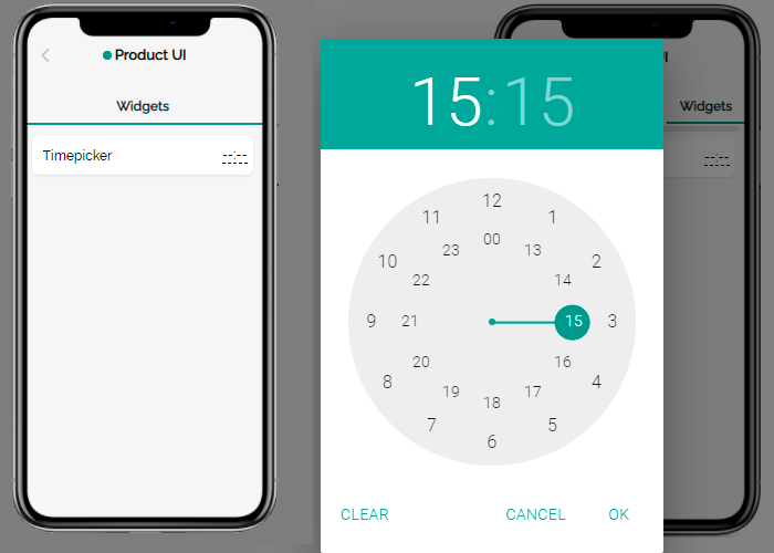
Timepicker
Allows setting up event time.
Sensors: compatible with any sensor transmitting string values.
Sensor Attributes:
- Data Types: string.
- Settable: true.
- Retained: true, false.
Advanced settings: none.
Usage scenarios: selecting the time of day to automatically start updating the device firmware, turn on/off watering, lighting, etc.
Widgets with similar functionality: none.
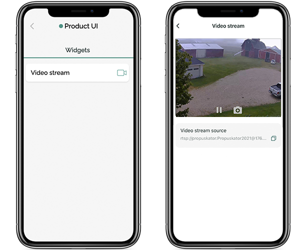
Video stream
Watch streaming video.
Sensors: compatible with any sensor transmitting string values, designed for use with RTSP video protocol.
Sensor Attributes:
- Data Types: string.
- Settable: true, false.
- Retained: true, false.
Advanced settings: entering an RTSP link to the video stream source.
Usage scenarios: viewing video from surveillance cameras in security systems, viewing video from the camera of a mobile robot.
Widgets with similar functionality: none.
Map
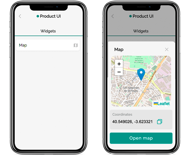
Displays the specified geotag on the map. Only decimal degrees format is allowed.
Sensors: compatible with any sensor transmitting string values, designed for use with geographic coordinates in decimal degrees format.
Sensor Attributes:
- Data Types: string.
- Settable: true, false.
- Retained: true, false.
Advanced settings: none.
Usage scenarios: displaying on the map the customer service center, the device manufacturer's office, or any other point.
Widgets with similar functionality: none.
Number
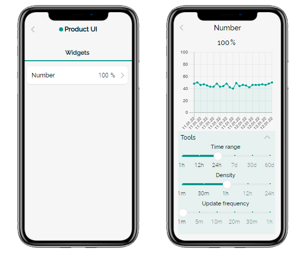
Displays the sensor's numeric values. Prevents the user from changing values. Allows viewing historical data graphs.
Sensors: compatible with any sensor transmitting numerical values.
Sensor Attributes:
- Data Types: integer, float.
- Settable: true, false.
- Retained: true, false.
Advanced settings: the option to choose the unit of measure. When selecting the “Graph” checkbox in the mobile app, historical data graphs will be available and the vendor will be able to define the Y scale's minimum and maximum values.
Usage scenarios: users can track historical data in cases when it’s available. For example, when monitoring the temperature and humidity of the air in a greenhouse.
Widgets with similar functionality: none.
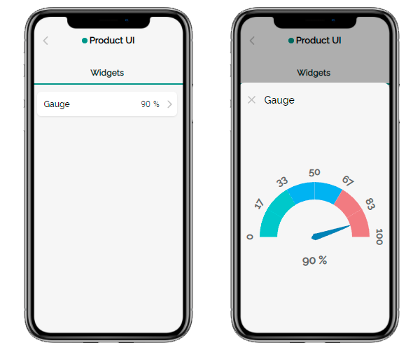
Gauge
Displays numerical values using a semicircular scale with an arrow.
Sensors: compatible with any sensor transmitting numerical values.
Sensor Attributes:
- Data Types: integer, float.
- Settable: true, false.
- Retained: true, false.
Advanced settings: the option to set the minimum and maximum value on the scale, as well as the unit of measure.
Usage scenarios: checking any numerical data (Wi-Fi signal strength, temperature, humidity, etc.)
Widgets with similar functionality: Signal lvl, Battery, Progress bar, Status, Mixed data.
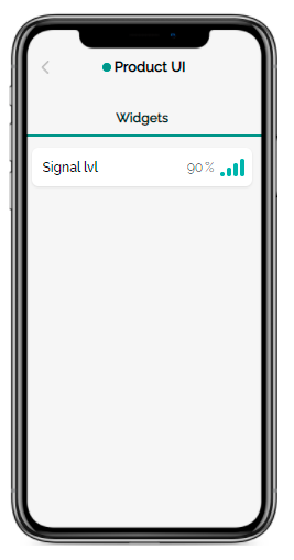
Signal lvl
Displays the sensor signal's level in percentage terms and in a scale.
Sensors: compatible with any sensor transmitting numerical values.
Sensor Attributes:
- Data Types: integer, float, string.
- Settable: true, false.
- Retained: true, false.
Advanced settings: the option to choose the minimum and maximum values used to calculate the signal level as a percentage.
Usage scenarios: checking Wi-Fi signal strength.
Widgets with similar functionality: Gauge, Battery, Progress bar, Status, Mixed data.
Battery
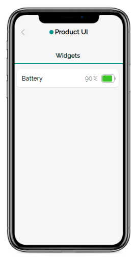
Displays the sensor signal's level in percentage terms and visually as a battery.
Sensors: compatible with any sensor transmitting numerical values.
Sensor Attributes:
- Data Types: integer, float, string.
- Settable: true, false.
- Retained: true, false.
Advanced settings: the option to set the minimum and maximum values used to calculate the percentage value.
Usage scenarios: monitoring the device’s battery charge level.
Widgets with similar functionality: Signal lvl, Gauge, Progress bar, Status, Mixed data.
Progress bar
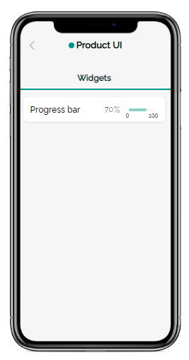
Displays the level of the sensor signal in the specified units and visually as a progress bar.
Sensors: compatible with any sensor transmitting numerical values.
Sensor Attributes:
- Data Types: integer, float, string.
- Settable: true, false.
- Retained: true, false.
Advanced settings: the option to set the minimum and maximum value on the scale, as well as the unit of measure.
Usage scenarios: checking any numerical data (Wi-Fi signal strength, temperature, humidity, etc.)
Widgets with similar functionality: Signal lvl, Gauge, Battery, Status, Mixed data.
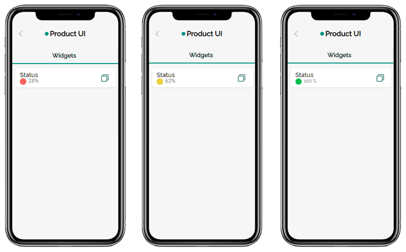
Status
Displays the level of the sensor signal in the specified units with the ability to copy the current value. Has a customizable color indicator to visually highlight various values and/or their ranges.
Sensors: compatible with any sensor transmitting any type of data, editable and non-editable, retained and non-retained.
Sensor Attributes:
- Data Types: any type of data.
- Settable: true, false.
- Retained: true, false.
Advanced settings: the option to set the unit of measure and set up color rules for specific sensor values or their ranges.
Usage scenarios: checking any data (Wi-Fi signal strength, temperature, humidity, etc.)
Widgets with similar functionality: Signal lvl, Gauge, Battery, Progress bar, Text, Mixed data.
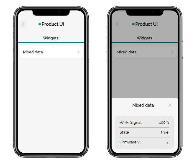
Mixed data
Displays data from up to three sensors in a single modal in a mobile application.
Sensors: compatible with any sensor transmitting any type of data, editable and non-editable, retained and non-retained.
Sensor Attributes:
- Data Types: any type of data.
- Settable: true, false.
- Retained: true, false.
Advanced settings: he ability to set the unit of measure, the value title and its translation into other languages for each sensor.
Usage scenarios: cchecking any telemetry and other data from the device’s sensors.
Widgets with similar functionality: Gauge, Signal lvl, Battery, Progress bar, Status.
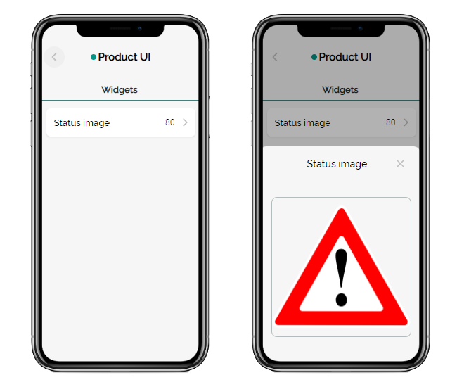
Status image
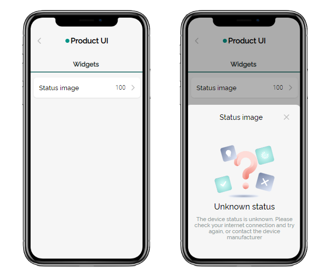
Displays the level of the sensor signal. When tapped, a modal window appears, the content of which depends on the widget settings. If a custom image is loaded for the current sensor value, it will be shown:
If there are no settings for the current sensor value, a standard modal will appear with a message about the unknown status:
Sensors: compatible with any sensor transmitting integer, string, or enum data, editable and non-editable, retained and non-retained.
Sensor Attributes:
- Data Types: integer, string, enum.
- Settable: true, false.
- Retained: true, false.
Advanced settings: the option to upload the custom image for a specific sensor value.
Usage scenarios: uploading visual cues on how to troubleshoot device operation problems that indicated by the sensor value.
Widgets with similar functionality: none.
Thermostat
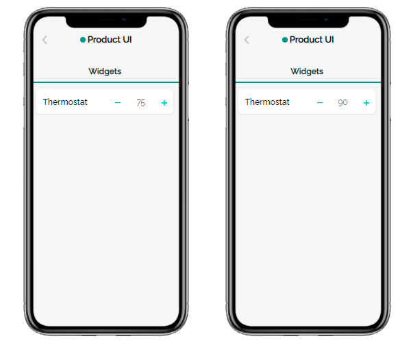
Displays the sensor's numeric values. Allows changing numeric values using the “+” and “-” buttons within the configured range.
Sensors: compatible with any sensor transmitting numerical values that can be changed manually.
Sensor Attributes:
- Data Types: integer, float.
- Settable: true.
- Retained: true, false.
Advanced settings: the option to set up the unit of measure and to set the range of sensor values that the user will be able to adjust, as well as the step in which changes will be made.
Usage scenarios: controlling the heating system, underfloor heating, and other systems for which a limited range of sensor values is appropriate.
Widgets with similar functionality: Slider.
Slider
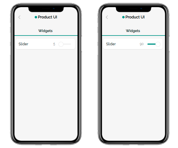
The slider for changing the numerical value of the sensor.
Sensors: compatible with any sensor transmitting numerical values that can be changed manually.
Sensor Attributes:
- Data Types: integer, float.
- Settable: true.
- Retained: true, false.
Advanced settings: the option to set up the unit of measure and to set the range of sensor values that the user will be able to adjust, as well as the step in which changes will be made.
Usage scenarios: adjusting the brightness of a lamp or LED strip.
Widgets with similar functionality: Thermostat.
Dimmer control
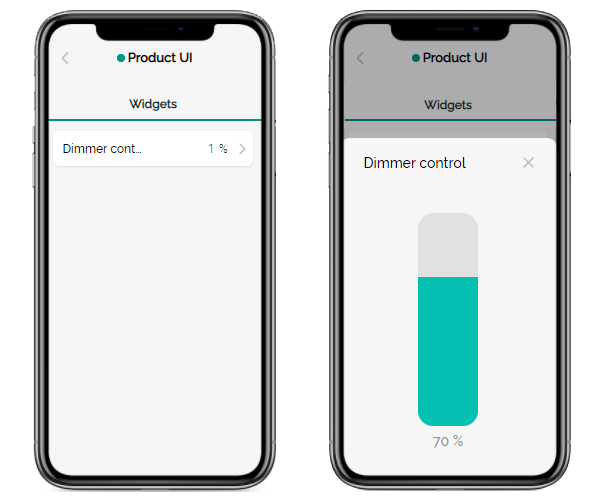
Displays the sensor's numeric values. Allows changing numeric values within the configured range using the slider-light regulator, which opens in the form of a modal window.
Sensors: compatible with any sensor transmitting numerical values that can be changed manually.
Sensor Attributes:
- Data Types: integer, float.
- Settable: true.
- Retained: true, false.
Advanced settings: the option to set up the unit of measure and to set the range of sensor values that the user will be able to adjust, as well as the step in which changes will be made.
Usage scenarios: adjusting the brightness of a lamp or LED strip.
Widgets with similar functionality: Thermostat, Slider.
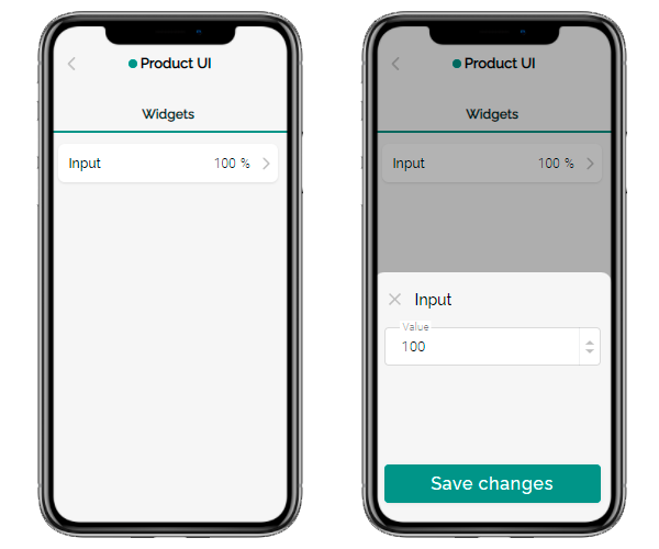
Input
Displays the sensor’s numeric or text values. If the transmitted data is changeable, the user of the mobile application can utilize the sensor to set an arbitrary value.
Sensors: compatible with any sensor transmitting numeric or text values.
Sensor Attributes:
- Data Types: integer, float, string.
- Settable: true, false.
- Retained: true, false.
Advanced settings: the option to set up the unit of measure.
Usage scenarios: checking any numerical or textual data: battery level, Wi-Fi signal, temperature, etc., adjusting the sensor value, such as the brightness of the LED.
Widgets with similar functionality: none.
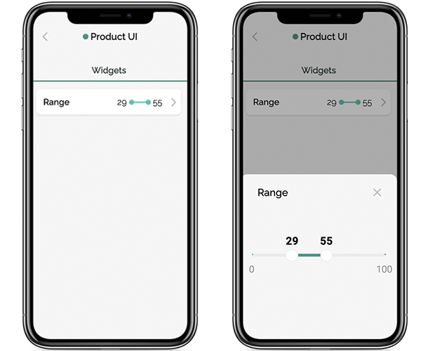
Range
Setting a range of sensor values instead of a specific value. For the widget to work correctly, specify two sensors of the same physical sensor in the firmware - to control the minimum and maximum values.
Sensors: compatible with any sensor transmitting numeric values.
Sensor Attributes:
- Data Types: integer, float.
- Settable: true.
- Retained: true, false.
Advanced settings: the option to set up the unit of measure and to set the range of sensor values that the user will be able to adjust, as well as the step in which changes will be made.
Usage scenarios: monitoring the air temperature in the greenhouse and sending a notification to the user if the value has gone beyond the specified range.
Widgets with similar functionality: none.
Text
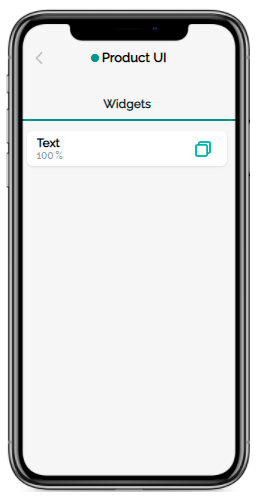
Displays sensor’s text and numeric values. Allows quickly copying the value by clicking on the widget.
Sensors: compatible with any sensor transmitting text or numeric values that cannot be changed manually.
Sensor Attributes:
- Data Types: integer, float, string, boolean, enum.
- Settable: false.
- Retained: true.
Advanced settings: the option to set up the unit of measure.
Usage scenarios: In-app display of data that can need to be copied quickly, such as the device's serial number.
Widgets with similar functionality: Status.
List
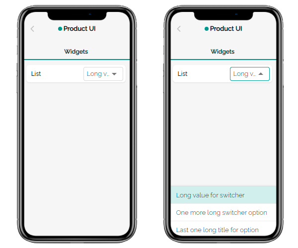
Drop-down list with values to choose from.
Sensors: compatible with any sensor transmitting numeric, text, or logical (on/off) values.
Sensor Attributes:
- Data Types: enum.
- Settable: true, false.
- Retained: true, false.
Advanced settings: setting the unit of measure.
Usage scenarios: selecting one of the configured modes of operation of the device.
Widgets with similar functionality: Switcher, Enum list.
Enum list
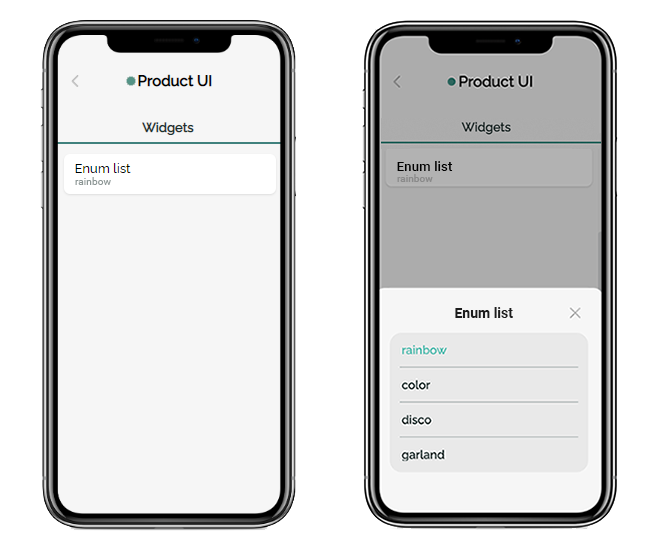
A modal window with a list that contains values to choose from.
Sensors: compatible with any sensor transmitting numeric, text, or logical (on/off) values.
Sensor Attributes:
- Data Types: enum.
- Settable: true, false.
- Retained: true, false.
Advanced settings: setting the unit of measure.
Usage scenarios: selecting one of the configured modes of operation of the device.
Widgets with similar functionality: Switcher, List.
Switcher
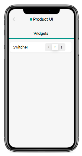
The switch with the ability to quickly select one of the values.
Sensors: compatible with any sensor transmitting numeric, text, or logical (on/off) values.
Sensor Attributes:
- Data Types: enum.
- Settable: true, false.
- Retained: true, false.
Advanced settings: none.
Usage scenarios: selecting one of the device operating modes.
Widgets with similar functionality: List, Enum list.
Bulb
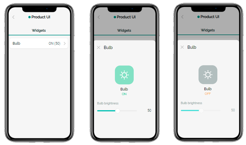
Allows turning the lamp on and off, as well as adjusting its brightness (if there is a brightness sensor).
Sensors: compatible with any lamps and LEDs.
Sensor Attributes:
- Data Types: integer, float, boolean.
- Settable: true, false.
- Retained: true, false.
Advanced settings: the option to set up the unit of measure and specify the range within which the user can adjust the brightness, as well as the increment by which adjustments are made (relevant only if there is a brightness sensor).
Usage scenarios: сontrolling main functions of the LED lamp.
Widgets with similar functionality: none
Toggle
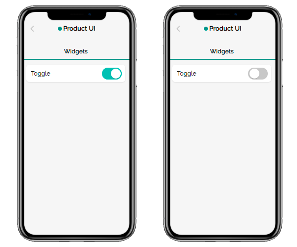
The switcher for activating/deactivating the sensor.
Sensors: compatible with any sensor having two logical values — on and off.
Sensor Attributes:
- Data Types: boolean.
- Settable: true, false.
- Retained: true, false.
Advanced settings: none.
Usage scenarios: turning on/off the device or its specific function.
Widgets with similar functionality: Door, Tumbler, Two-way button, Custom toggle, Status icons.
Custom toggle
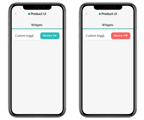
Button with customizable appearance for activating/deactivating the sensor.
Sensors: compatible with any sensor having two logical values — on and off.
Sensor Attributes:
- Data Types: boolean.
- Settable: true, false.
- Retained: true, false.
Advanced settings: customization of button header and color for each of the two sensor state: active and inactive.
Usage scenarios: turning on/off the device or its specific function.
Widgets with similar functionality: Door, Tumbler, Two-way button, Toggle, Status icons.
Two-way button
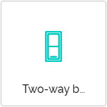
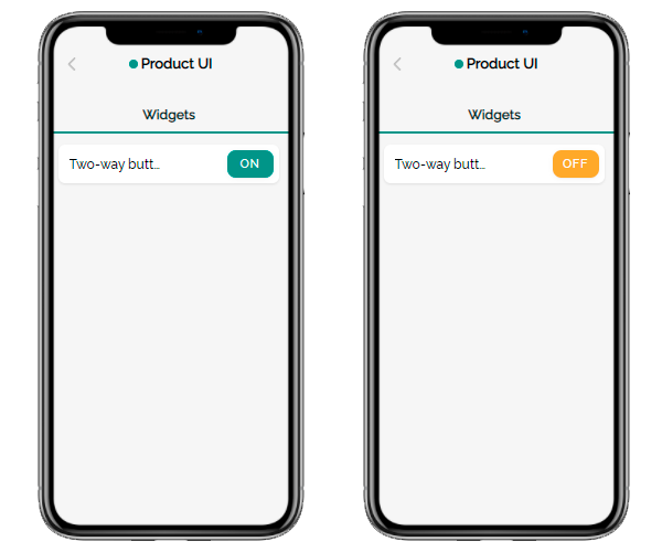
Standard-looking button for turning the sensor on and off: green (ON) and orange (OFF).
Sensors: compatible with any sensor having two logical values — on and off.
Sensor Attributes:
- Data Types: boolean.
- Settable: true, false.
- Retained: true, false.
Advanced settings: none.
Usage scenarios: turning on/off the device or its specific function.
Widgets with similar functionality: Door, Toggle, Tumbler, Custom toggle, Status icons.
Tumbler
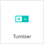
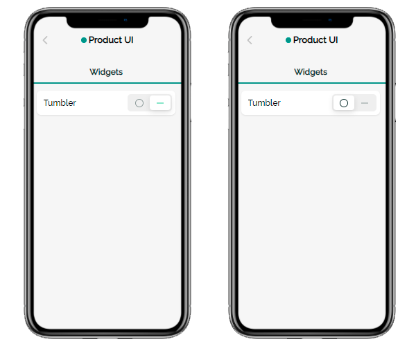
Standard tumbler for turning the sensor on and off: I-O.
Sensors: compatible with any sensor having two logical values — on and off.
Sensor Attributes:
- Data Types: boolean.
- Settable: true, false.
- Retained: true, false.
Advanced settings: none.
Usage scenarios: turning on/ off the device or its specific function.
Widgets with similar functionality: Door, Toggle, Two-way button, Custom toggle, Status icons.
Door
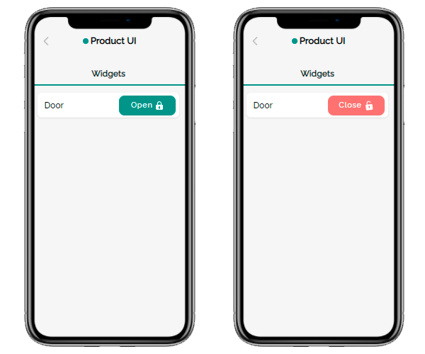
Standard-looking button for turning the sensor on and off: the green one with the word "Open" and image of a closed padlock, and red with the word "Close" and an image of an open padlock.
Sensors: compatible with any sensor having two logical values — on and off.
Sensor Attributes:
- Data Types: boolean.
- Settable: true.
- Retained: true, false.
Advanced settings: none.
Usage scenarios: controlling electric locks, barriers, electric smart curtains.
Widgets with similar functionality: Toggle, Tumbler, Two-way button, Custom toggle, Status icons.
Status icons
Widget to control up to three boolean sensors with the ability for the vendor to set custom icons for each sensor.
Sensors: compatible with any sensor having two logical values — on and off.
Sensor Attributes:
- Data Types: boolean.
- Settable: true.
- Retained: true, false.
Advanced settings: uploading an icon for each sensor and customizing its background colors for the positive and negative states..
Usage scenarios: turning on/ off up to three specific device functions.
Widgets with similar functionality: Toggle, Tumbler, Two-way button, Custom toggle, Door.
LED
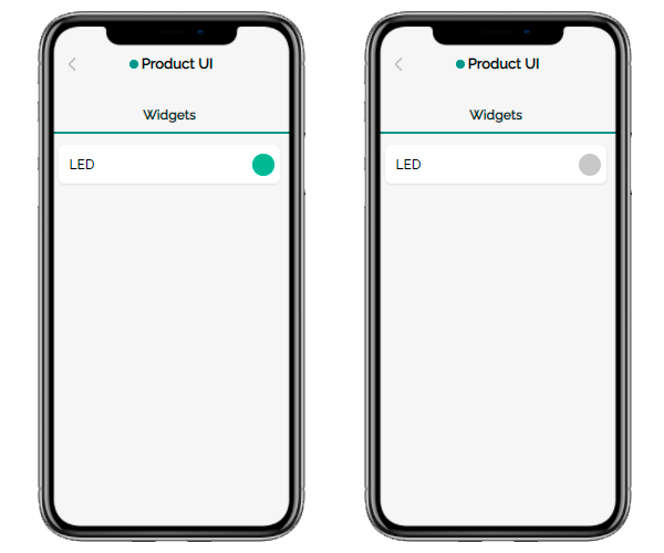
Indicates whether the sensor is on or off. Does not allow to toggle the value.
Sensors: compatible with any sensor having two logical values — on and off.
Sensor Attributes:
- Data Types: boolean.
- Settable: true, false.
- Retained: true, false.
Advanced settings: selecting a widget design from one of five available colors.
Usage scenarios: controlling the status of any device — whether it’s on or off.
Widgets with similar functionality: Motion sensor.
Motion sensor
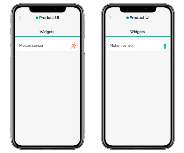
Displays the sensor's state — whether it’s on or off — as a moving or standing man. Does not allow to toggle the value.
Sensors: compatible with any sensor having two logical values — on and off.
Sensor Attributes:
- Data Types: boolean.
- Settable: true, false.
- Retained: true, false.
Advanced settings: none.
Usage scenarios: monitoring the state of a moving device (for example, a robot) — whether it’s active or not.
Widgets with similar functionality: LED.
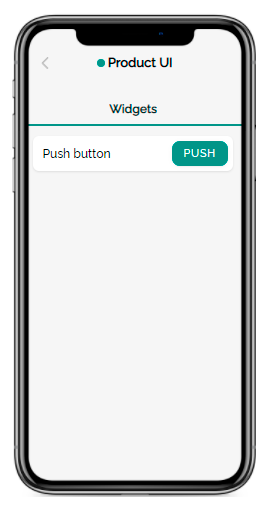
Push button
Sensor activation button.
Sensors: compatible with any sensor that runs once and doesn't require shutdown.
Sensor Attributes:
- Data Types: boolean.
- Settable: true.
- Retained: false.
Advanced settings:
- Setting a custom button name, as well as editing its translation into other languages available in the mobile application interface.
- Setting a custom button color instead of the default.
- Activation/deactivation of a modal that confirms the action on the button with customization of the modal’s message title and text, as well as their translations into other languages available in the mobile application.
Usage scenarios: starting the device firmware update manually.
Widgets with similar functionality: Firmware update, Condition button.
Condition button
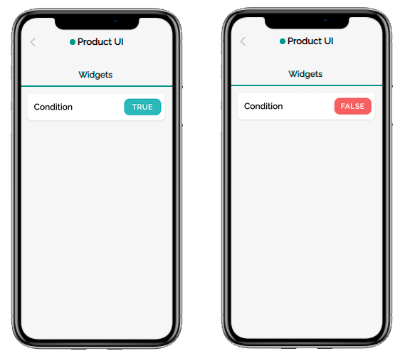
Button to start some actions on the firmware, depending on the conditions. For example, a device can have the following statuses: “Active” and “Inactive”. Depending on the current status, the user can run certain functions:
- If the current status is “Inactive”, the user sees a green “True” button, clicking on which they will transfer the device to the “Active” status.
- If the current status is “Active”, the user sees a red “False” button, clicking on which they will transfer the device to the status “Inactive”.
The vendor can add up to 10 statuses, flexibly configure the name and color of the button for each and set a modal to confirm all or some of the user’s actions. The button name and modal content can be translated into other languages available in the mobile app.
Sensors: compatible with any sensor.
Sensor Attributes:
- Data Types: integer, float, boolean, color, enum, string.
- Settable: true, false.
- Retained: true, false.
Advanced settings:
- Setting a custom button name for each status value, as well as editing its translation into other languages available in the mobile application interface.
- Setting a custom button color for each status value.
- Activation/deactivation of a modal for each status value that confirms the action on the button with customization of the modal’s message title and text, as well as their translations into other languages available in the mobile application.
Usage scenarios: switching the state of the device or its individual sensor if the business logic provides for many such states, for example, “Ready”, “Running”, “Paused”, “Off”, etc.
Widgets with similar functionality: Push button, Firmware update.
Firmware update
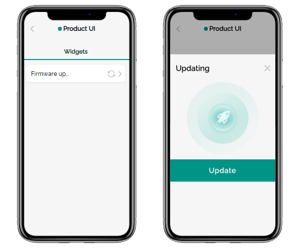
The widget for the manual firmware update. It has a modern interface that accompanies the update delivery process.
Sensors: compatible with the following types of sensors responsible for updating the device firmware:
- boolean - to update the firmware,
- string, integer, float - to send a message about the current update status.
Sensor Attributes:
- Data Types: boolean, string.
- Settable: true.
- Retained: false.
Advanced settings: setting up custom notifications that accompany the firmware update process:
- failed to check message;
- updates available message;
- up-to-date message;
- update failed message;
- successfully updated message.
Usage scenarios: manual updating of the device firmware by the end-user.
Widgets with similar functionality: Push button, Condition button.
Reset
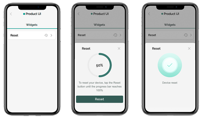
Widget for resetting the device to factory settings. To protect the end user from accidentally resetting the device, the widget asks them to confirm their desire to perform this action several times.
To reset the device, the user must fill the animated progress bar to 100%. If they do not press the reset button for some time, the progress bar is set to zero.
Sensors: compatible with the following types of sensors responsible for resetting the device:
- boolean (non-retained, editable) - to reset the device,
- integer (retained, editable) - to send a message about the current reset status.
Sensor Attributes:
- Data Types: boolean, integer.
- Settable: true.
- Retained: false.
Advanced settings: none.
Usage scenarios: manual resetting the device to factory settings by the end-user.
Widgets with similar functionality: none.
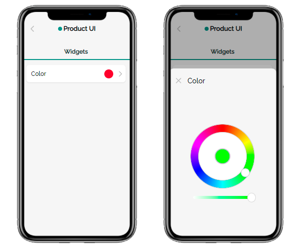
Color
Palette to set the desired color.
Sensors: compatible with any sensor accepting a color value in RGB or HSV format (for example, LED lamps or garlands).
Sensor Attributes:
- Data Types: color.
- Settable true.
- Retained: true.
Advanced settings: the option to set up the unit of measure.
Usage scenarios: setting the glow color of the LED lamp.
Widgets with similar functionality: none.
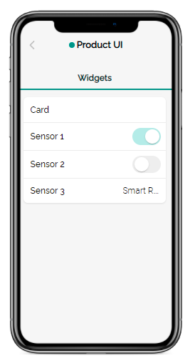
Card
Widget for grouping any device sensors in one card.
Sensors: any supported.
Sensor Attributes:
- Data Types: any supported.
- Settable: true, false.
- Retained: true, false.
Advanced settings: none.
Usage scenarios: quick access to several related sensors within one widget.
Widgets with similar functionality: Grid.
Grid
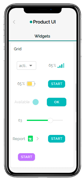
An aggregator that makes it possible to place up to 20 functional widgets on a grid conveniently for the end users of the device.
Sensors: any supported.
Sensor Attributes:
- Data Types: any supported.
- Settable: true, false.
- Retained: true, false.
Advanced settings: none.
Usage scenarios: quick access to several related sensors within one widget.
Widgets with similar functionality: Card.
Separator
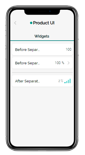
A horizontal line to visually separate functional widgets or groups of widgets in the mobile app.
Sensors: not needed.
Advanced settings: none.
Usage scenarios: visual separation of widgets or groups of widgets by the vendor when customizing the mobile application interface.
Widgets with similar functionality: none.
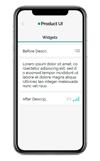
Description
Allows vendors to place any text in the mobile application interface between functional widgets.
Sensors: not needed.
Advanced settings: the ability to add a translation of the description into other languages available in the mobile application.
Usage scenarios: placing text tips or titles for the widgets below by the vendor when customizing a mobile app interface.
Widgets with similar functionality: none.
